QENS data reduction#
This notebook will guide you through the data reduction for the QENS experiment that you simulated with McStas yesterday.
The following is a basic outline of what this notebook will cover:
Loading the NeXus files that contain the data
Inspect/visualize the data contents
How to convert the raw
time-of-flightcoordinate to something more useful (\(\Delta E\))Write the results to file
import matplotlib.pyplot as plt
import numpy as np
import scipp as sc
import plopp as pp
import scippneutron as scn
import qens_utils as utils
Process the elastic sample data#
Load raw data#
Begin by loading and investigating the data obtained from the elastic sample.
folder = "../3-mcstas/QENS_elastic"
events = utils.load_qens(folder)
The first way to inspect the data is to view the HTML representation of the loaded object.
Try to explore what is inside the data, and familiarize yourself with the different sections (Dimensions, Coordinates, Data).
events
- event: 217742
- analyzer_angle(event)float64rad0.042, 0.042, ..., 0.042, 0.042
Values:
array([0.04157062, 0.04157062, 0.04157062, ..., 0.04157062, 0.04157062, 0.04157062], shape=(217742,)) - analyzer_dspacing(event)float64Å3.135, 3.135, ..., 3.135, 3.135
Values:
array([3.135, 3.135, 3.135, ..., 3.135, 3.135, 3.135], shape=(217742,)) - analyzer_position(event)vector3m[1.02606043 0. 2.81907786], [1.02606043 0. 2.81907786], ..., [ 1.02606043 0. -2.81907786], [ 1.02606043 0. -2.81907786]
Values:
array([[ 1.02606043, 0. , 2.81907786], [ 1.02606043, 0. , 2.81907786], [ 1.02606043, 0. , 2.81907786], ..., [ 1.02606043, 0. , -2.81907786], [ 1.02606043, 0. , -2.81907786], [ 1.02606043, 0. , -2.81907786]], shape=(217742, 3)) - bank(event)int64𝟙0, 0, ..., 7, 7
Values:
array([0, 0, 0, ..., 7, 7, 7], shape=(217742,)) - position(event)vector3m[0.07171201 0.27209626 0.19702712], [0.07171201 0.20299308 0.19702712], ..., [ 0.07171201 0.22744766 -0.19702712], [ 0.07171201 0.23300546 -0.19702712]
Values:
array([[ 0.07171201, 0.27209626, 0.19702712], [ 0.07171201, 0.20299308, 0.19702712], [ 0.07171201, 0.20818331, 0.19702712], ..., [ 0.07171201, 0.25323619, -0.19702712], [ 0.07171201, 0.22744766, -0.19702712], [ 0.07171201, 0.23300546, -0.19702712]], shape=(217742, 3)) - sample_position()vector3m[0. 0. 0.]
Values:
array([0., 0., 0.]) - source_position()vector3m[ -0. -0. -150.]
Values:
array([ -0., -0., -150.]) - tof(event)float64ms247.051, 246.710, ..., 246.727, 246.666
Values:
array([247.05093307, 246.70989364, 246.64996667, ..., 246.6765676 , 246.72695681, 246.6658975 ], shape=(217742,)) - y(event)float64m0.272, 0.203, ..., 0.227, 0.233
Values:
array([0.27209626, 0.20299308, 0.20818331, ..., 0.25323619, 0.22744766,
       0.23300546], shape=(217742,))
- (event)float64counts5.161e-10, 1.274e-06, ..., 0.226, 0.341σ = 5.161e-10, 1.274e-06, ..., 0.226, 0.341
Values:
array([5.16091809e-10, 1.27414977e-06, 1.98199385e-01, ...,
       4.18051476e-07, 2.26328483e-01, 3.40807653e-01], shape=(217742,))

Variances (σ²):
array([2.66350756e-19, 1.62345763e-12, 3.92829963e-02, ...,
       1.74767036e-13, 5.12245823e-02, 1.16149856e-01], shape=(217742,))
Visualize the raw data#
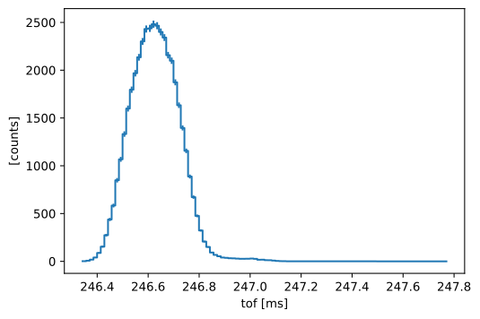
Here is a histogram of the raw data in tof:
events.hist(tof=100).plot()
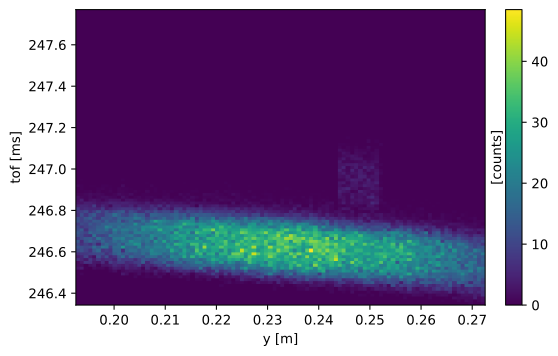
It is more enlightening to look at a 2D histogram in tof and y as this shows a defect of the detector for a certain y-range:
events.hist(tof=100, y=100).plot()
Exercise 1: mask bad region#
We need to handle the events that are affected by the detector defect. First, we should find exactly what part of the detector is affected.
Exercise 1.1: find bad region#
We can make a plot with a slider (see slicer) to explore the different banks. Move the slider below to find the faulty bank (number in the box next to the slider).
Also, zoom in on the bad region and read off the range in y that has a problem.
Note:
The plot below is not interactive in the book. Download and run the Jupyter notebook yourself to use the controls.
fig = pp.slicer(events.group("bank").hist(tof=100, y=100), mode="single")
fig
Exercise 1.2: create and apply mask#
Now, we create a mask for the bad region and apply it to the data. We do so by defining a condition on the event coordinates with respect to the ranges that we found in exercise 1a.
Steps:
Define a mask by comparing the y coordinate to the range found above and comparing the bank coordinate to the faulty bank found above. Combine the individual conditions into a single mask.
Apply the mask by making a copy of the events using
masked_events = events.copy()and assigning the mask tomasked_events.masks.
Hints:
Use
events.coords["y"] >= mask_y_minto get a mask that masks all events with a y value greater thanmask_y_min.Similarly, you can compare with the maximum y value that you want to mask using the
<operator.
Use
events.coords['bank'] == masked_bankto get a mask for the bank that has a fault.Combine masks using
mask = mask_1 & mask_2to get a union ofmask_1andmask_2.
Solution:
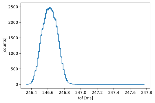
We can now make a tof histogram again to see how the masked events were dropped:
masked_events.hist(tof=100).plot()
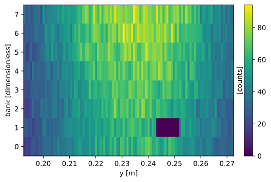
We can also see the mask more directly by histogramming in the dimensions that we used for masking:
masked_events.group("bank").hist(y=100).plot()
Exercise 1.3: explore the masked data (optional)#
If you want to, make some more plots like we did above to see how the mask impacts the data. For example, try making a 2D plot in y and tof with the masked data.
Hint:
You can make slicer plot with multiple lines to compare masked and unmasked data using
pp.slicer({"unmasked": data_1, "masked": data_2}, mode="single")
And as the data, you can group the events by bank and histogram in tof. See the plots above for how that can be done.
Solution:
Transform to energy transfer and momentum transfer#
The next step is to compute the measured energy transfer and momentum transfer in the sample from time-of-flight and the other coordinates of our data. We use scipp.transform_coords for this purpose.
ScippNeutron provides some pre-defined functions for coordinate transformations, see the documentation for a list. In particular, it provides scippneutron.conversion.tof.energy_transfer_indirect_from_tof which computes the energy transfer for an indirect-geometry spectrometer:
where \(m_n\) is the neutron mass, \(L_1\) is the primary flight path length (from source to sample), and \(L_2\) is the secondary flight path length (from sample to detector). The intermediate variable \(t_0\) is the the time of flight for the secondary path such that \((t - t_0)\) is the arrival time at the sample.
While ScippNeutron provides most of what we need, we have to define some custom components for our specific instrument. We require functions to compute
L2, the path length of the scattered neutron. The default function in ScippNeutron assumes a straight path but here, we need to take the reflection from the analyzer crystal into account: \(L_2 = |\overline{\mathsf{sample},\mathsf{analyzer}}| + |\overline{\mathsf{analyser},\mathsf{detector}}|\)
final_wavelength, the neutron wavelength that the analyzer selects for. We compute it from the known \(d\)-spacing of the analyzer \(d_a\) and the scattering angle off the analyzer \(\theta_a\): \(\mathsf{final\_wavelength} = 2 d_a \sin{\theta_a}\)
Q, the momentum transfer: \(Q = |k_i - k_f|\), where \(k_i\) and \(k_f\) are the incident and final wavevectors, respectively. Here, the neutrons scatter almost elastically, such that we use \(|k_i| = |k_f| = 2\pi / \mathsf{final\_wavelength}\). We define a function to compute \(Q\) already now but will only use it later.
final_energy, the energy of the neutrons that hit the detector (more below): \(\mathsf{final\_energy} = \displaystyle\frac{m_n}{2} v_f^2\)
The first three are implemented below. They use the positions and analyzer parameters in the input data.
def backscattered_l2(position, sample_position, analyzer_position):
    """
    Compute the length of the secondary flight path for backscattering off an analyzer.
    """
    return sc.norm(position - analyzer_position) + sc.norm(
        analyzer_position - sample_position
    )


def wavelength_from_analyzer(analyzer_dspacing, analyzer_angle):
    """
    Compute the neutron wavelength after scattering from the analyzer's d-spacing.

    Assuming Bragg scattering in the analyzer, the wavelength is
        wavelength = 2 * d * sin(theta)

    Where
        d is the analyzer's d-spacing,
        theta is the scattering angle or equivalently, the tilt of the analyzer
              w.r.t. to the sample-analyzer axis.
    """
    # 2*theta is the angle between transmitted and scattered beam.
    return (
        2
        * analyzer_dspacing
        * sc.sin(sc.scalar(np.pi / 2, unit="rad") - analyzer_angle.to(unit="rad"))
    )


def momentum_transfer(
    incident_beam, sample_position, analyzer_position, final_wavelength
):
    """
    Compute the absolute value of the momentum transfer.
    """
    # The data are close to the elastic line
    # => use incident_wavelength = final_wavelength
    k = 2 * np.pi / final_wavelength

    scattered_beam = analyzer_position - sample_position
    kf = scattered_beam / sc.norm(scattered_beam) * k
    ki = incident_beam / sc.norm(incident_beam) * k

    return sc.norm(ki - kf)
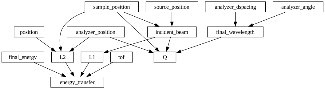
We can start assembling the graph to compute the energy transfer:
from scippneutron.conversion.graph.beamline import beamline
from scippneutron.conversion.tof import energy_transfer_indirect_from_tof

graph = {
    # Functions for the beamline geometry.
    **beamline(scatter=True),
    # The default energy transfer function.
    "energy_transfer": energy_transfer_indirect_from_tof,
    # Replace L2 and two_theta with our own implementations.
    "L2": backscattered_l2,
    # Insert new functions for the wavelength and Q.
    "final_wavelength": wavelength_from_analyzer,
    "Q": momentum_transfer,
}
# Optional: remove unused functions in order to clean up the image below.
del graph["scattered_beam"]
del graph["two_theta"]
del graph["Ltotal"]
sc.show_graph(graph, simplified=True)
Exercise 2: Compute energy transfer#
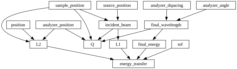
We can see that final_energy is not yet linked to final_wavelength in the graph.
Your task is to implement a function def final_energy(final_wavelength) to fill in the gap.
The energy is given by
where \(v_f\) is the speed of the scattered neutron and \(m_n\) is the neutron mass.
Exercise 2.1: Finish the graph#
Steps:
Define a new function that computes the final energy given the equations above.
Tip: Ensure that the result has unit
meV.Tip: Use sc.constants to get values for \(\hbar\) (or \(h\)) and \(m_n\).
Insert the new function into the graph.
Solution:
Exercise 2.2: Compute energy transfer with the masked data#
Use masked_events.transform_coords to compute "energy_transfer".
Assign the result to in_energy_transfer.
Exercise 2.3: Compute energy transfer for unmasked data#
For comparison, also compute energy transfer with the original data without a mask.
Assign the result to in_energy_transfer_unmasked.
Solution:
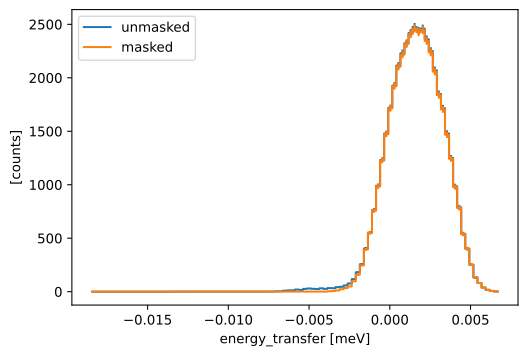
Now we can plot the masked and unmasked data to compare them. As always, we first need to histogram them.
masked_hist = in_energy_transfer.hist(energy_transfer=100)
unmasked_hist = in_energy_transfer_unmasked.hist(energy_transfer=100)
And finally, we can plot the data:
pp.plot(
    {
        "unmasked": unmasked_hist,
        "masked": masked_hist,
    }
)
Exercise 2.4: Compute energy and momentum transfer#
So far, we combined events for all momentum transfers when making 1D plots.
Now, we want to resolve the momentum transfer and get data in 2 dimensions: energy transfer and Q.
The coordinate transformation graph already contains a function to compute Q so we just need to call transform_coords again.
Compute both energy_transfer and Q from masked_events and assign the result to in_Q_E.
Hint
You can pass multiple output coordinate names to transform_coords using
data.transform_coords(["coord_1", "coord_2"], graph=graph)
Solution:
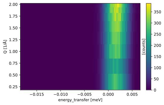
We can see that there are only 8 different Q values:
np.unique(in_Q_E.coords["Q"].values)
array([0.34832762, 0.68607149, 1.00296942, 1.28939263, 1.5366383 ,
       1.73719399, 1.88496592, 1.97546412])
The reason is that we use |k_i| = |k_f| to compute Q and each analyzer and thus detector bank only contributes a single Q value.
We have 8 analyzers, so we also have 8 Q’s.
We want to group by those Q values and histogram in energy transfer as usual. For this, we use
.group("Q")to make a bin for each unique Q value.hist(energy_transfer=100)to make a histogram with 100 bins in energy transfer.
Q_E_hist = in_Q_E.group("Q").hist(energy_transfer=100)
Q_E_hist.plot()
Exercise 2.5: Plot different Q’s separately (optional)#
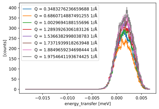
If you want to, make a 1D plot (counts vs energy transfer) for each Q value.
Hints:
You can loop over the Q values using something like
for i in range(8):
    single_Q = Q_E_hist["Q", i]
You can plot multiple lines using a dictionary:
sc.plot({"a": data_1, "b": data_2}).
Solution:
Exercise 3: Compute energy and momentum transfer for all samples#
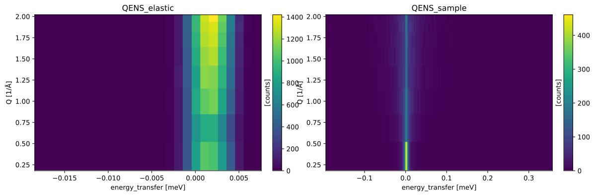
We have only looked at one of our two samples so far. Now, we repeat the same procedure for the other one.
Your task is to load the other sample, mask the broken detector region, and compute energy_transfer and Q. (You don’t need to repeat the calculation for the unmasked data.)
Hints:
Write a function that encapsulates the whole procedure.
Store the results for all samples in a
dict. This way, you can easily plot it usingsc.plot.Use a scalar variable with a unit, e.g.
sc.scalar(0.01, unit="meV"), for the histogramming to get a constant bin width.
folders = (
    "../3-mcstas/QENS_elastic",
    "../3-mcstas/QENS_sample"
)
Solution:
Save result to disk#
Finally, we need to save our results to disk so that the reduced data can be forwarded to the next step in the pipeline (data analysis). We will use a Scipp HDF5 file for this.
This code assumes that you stored your histograms in a dict called results.
If this is not the case, you need to modify the code below.
from scippneutron.io import save_xye

for name, result in results.items():
    # Rename 'energy_transfer' to 'energy' because the
    # analysis software expects this name.
    data = result.rename(energy_transfer="energy")
    data.save_hdf5(f"energy_{name}.h5")
Sciline workflow#
Before proceeding in this section, you should run through the Introduction to Sciline notebook!
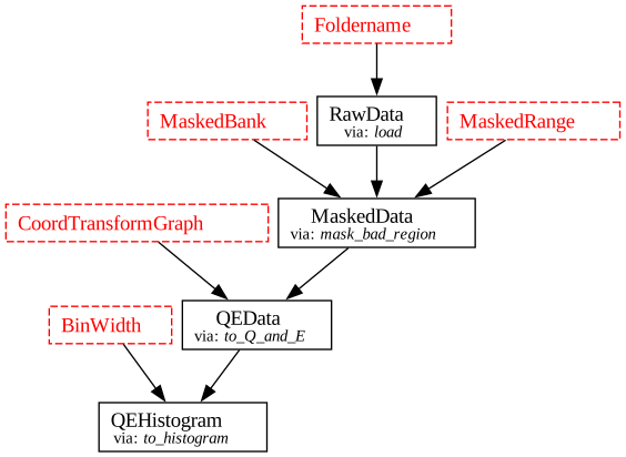
Below we build a re-usable Sciline workflow for reducing the QENS data. We wrap the operations that were carried out throughout this notebook into function that have the correct type-annotations, building a pipeline of connected steps.
The custom types have been created for you in the qens_utils module, and are imported from there.
Take some time to read through the code and understand the different parts. Ask questions if anything is unclear.
import sciline as sl
from qens_utils import *


def load(folder: Foldername) -> RawData:
    """Load raw data from file"""
    return RawData(utils.load_qens(folder))


def mask_bad_region(
    data: RawData, masked_range: MaskedRange, masked_bank: MaskedBank
) -> MaskedData:
    y = data.coords["y"]
    mask = (
        (y >= masked_range[0])
        & (y < masked_range[1])
        & (data.coords["bank"] == masked_bank)
    )
    return MaskedData(data.assign_masks(bad_timing=mask))


def to_Q_and_E(
    masked: MaskedData, graph: CoordTransformGraph
) -> QEData:
    return QEData(
        masked.transform_coords(["energy_transfer", "Q"], graph=graph)
    )


def to_histogram(
    data: QEData, bin_width: BinWidth
) -> QEHistogram:
    return QEHistogram(data.group("Q").hist(energy_transfer=bin_width))


wf = sl.Pipeline((load, mask_bad_region, to_Q_and_E, to_histogram))

wf.visualize()
Exercise 4: Set the workflow parameters#
In the visualization above, the red boxes indicate missing values; parameters required by the computation that have yet to be set on the workflow.
Using the wf[TYPE] = VALUE syntax, set the missing parameters on the workflow.
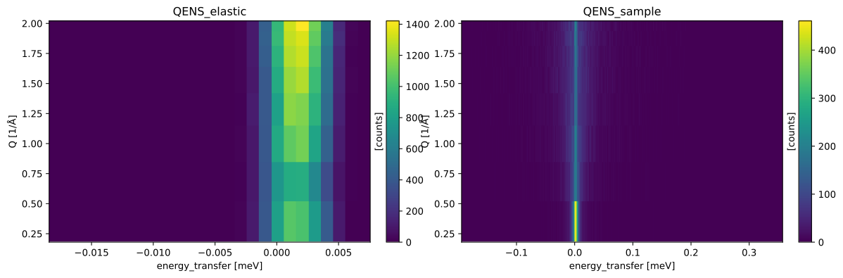
Once you have done so, use wf.compute(QEHistogram) multiple times to compute the final result for each sample,
making sure to change the folder to load the data from each time.
Make one figure per sample.
Solution:
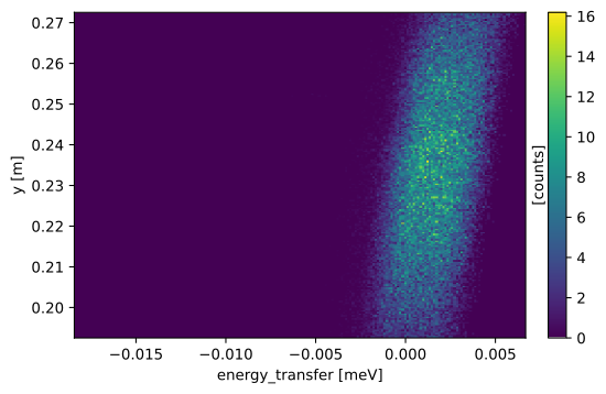
Exercise 5: Make a \((y, \Delta E)\) map#
We wish to make a 2d plot of counts as a function of \(y\) and energy transfer for one of runs (e.g. elastic). You have to:
identify one of the intermediate results that would contain the necessary information
compute that intermediate result
histogram the result (200 bins in
yand 200 bins inenergy_transferwill do nicely)plot it on a figure
Hint: The solution is very simple, and should only be 2-3 lines of python at most!
Solution: